Heuristics for supporting cooperative dashboard design
Abstract
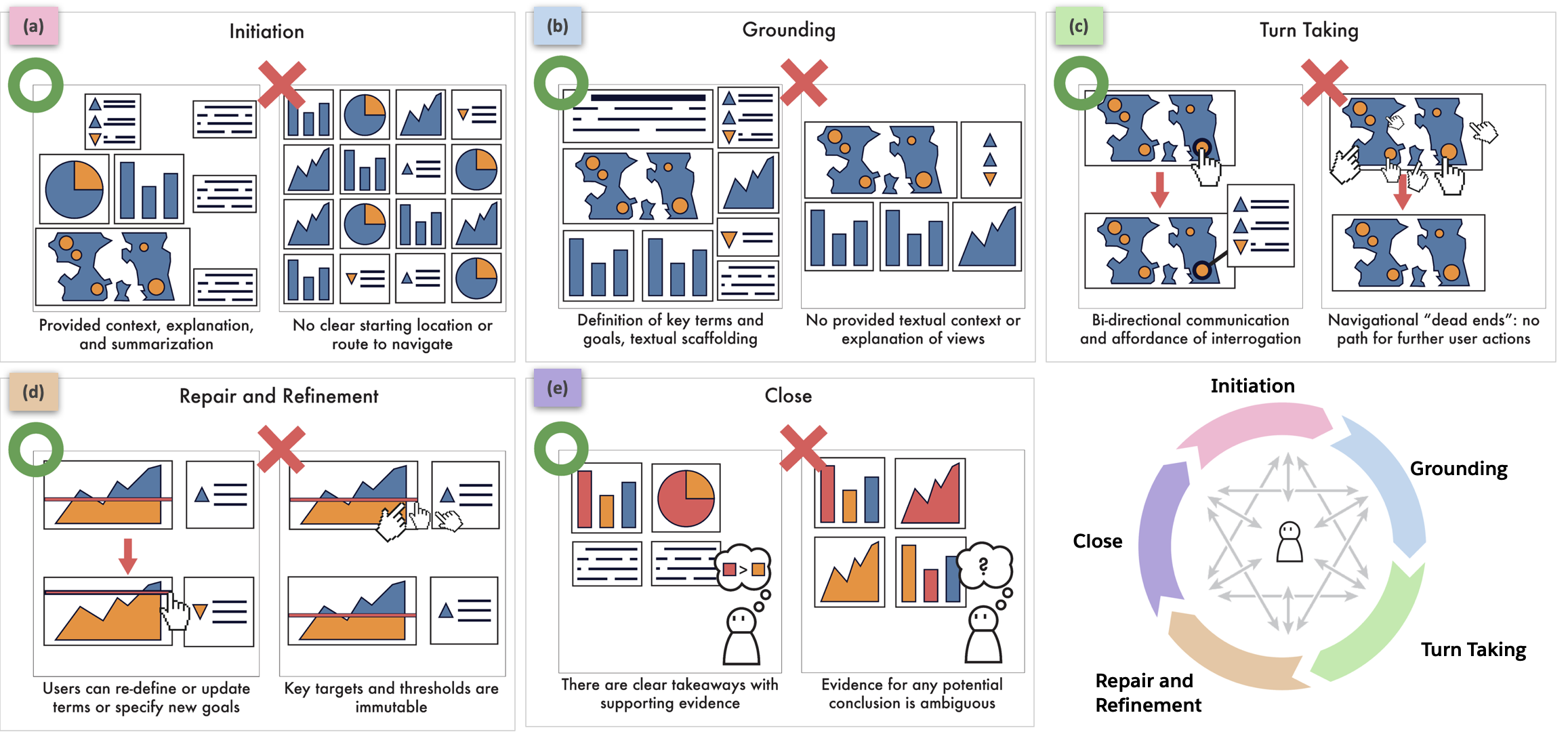
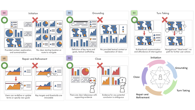
Dashboards are no longer mere static displays of metrics; through functionality such as interaction and storytelling, they have evolved to support analytic and communicative goals like monitoring and reporting. Existing dashboard design guidelines, however, are often unable to account for this expanded scope as they largely focus on best practices for visual design. In contrast, we frame dashboard design as facilitating an analytical conversation: a cooperative, interactive experience where a user may interact with, reason about, or freely query the underlying data. By drawing on established principles of conversational flow and communication, we define the concept of a cooperative dashboard as one that enables a fruitful and productive analytical conversation, and derive a set of 39 dashboard design heuristics to support effective analytical conversations. To assess the utility of this framing, we asked 52 computer science and engineering graduate students to apply our heuristics to critique and design dashboards as part of an ungraded, opt-in homework assignment. Feedback from participants demonstrates that our heuristics surface new reasons dashboards may fail, and encourage a more fluid, supportive, and responsive style of dashboard design. Our approach suggests several compelling directions for future work, including dashboard authoring tools that better anticipate conversational turn-taking, repair, and refinement and extending cooperative principles to other analytical workflows.
Authors


Citation
Heuristics for supporting cooperative dashboard design
Vidya Setlur, Michael Correll, Arvind Satyanarayan, and Melanie Tory. IEEE Transactions on Visualization and Computer Graphics—VIS/TVCG. 2023.
PDF | Preprint | Supplement | BibTeX
Khoury Vis Lab — Northeastern University
* West Village H, Room 302, 440 Huntington Ave, Boston, MA 02115, USA
* 100 Fore Street, Portland, ME 04101, USA
* Carnegie Hall, 201, 5000 MacArthur Blvd, Oakland, CA 94613, USA