Multiple Forecast Visualizations (MFVs): trade-offs in trust and performance in multiple COVID-19 forecast visualizations
Abstract
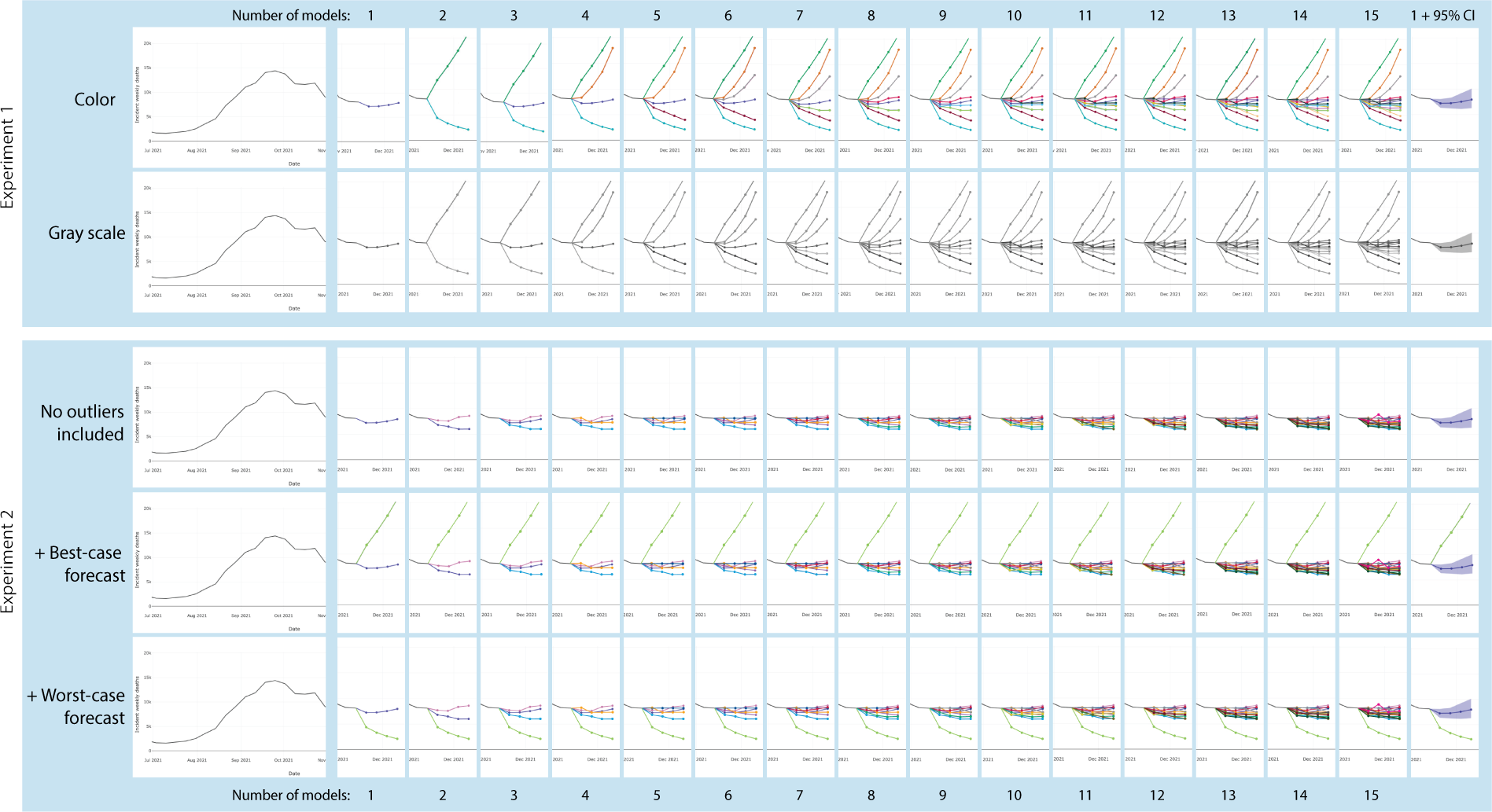
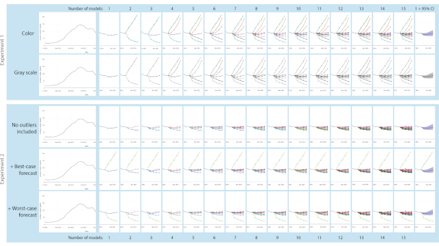
The prevalence of inadequate SARS-COV-2 (COVID-19) responses may indicate a lack of trust in forecasts and risk communication. However, no work has empirically tested how multiple forecast visualization choices impact trust and task-based performance. The three studies presented in this paper (N=1299) examine how visualization choices impact trust in COVID-19 mortality forecasts and how they influence performance in a trend prediction task. These studies focus on line charts populated with real-time COVID-19 data that varied the number and color encoding of the forecasts and the presence of best/worst-case forecasts. The studies reveal that trust in COVID-19 forecast visualizations initially increases with the number of forecasts and then plateaus after 6–9 forecasts. However, participants were most trusting of visualizations that showed less visual information, including a 95% confidence interval, single forecast, and grayscale encoded forecasts. Participants maintained high trust in intervals labeled with 50% and 25% and did not proportionally scale their trust to the indicated interval size. Despite the high trust, the 95% CI condition was the most likely to evoke predictions that did not correspond with the actual COVID-19 trend. Qualitative analysis of participants' strategies confirmed that many participants trusted both the simplistic visualizations and those with numerous forecasts. This work provides practical guides for how COVID-19 forecast visualizations influence trust, including recommendations for identifying the range where forecasts balance trade-offs between trust and task-based performance.
Materials
PDF | Preprint | DOI | Preregistration | Video preview | Demo video | News | BibTeX | VIS 2022 Best Paper Award!Authors


Citation
Multiple Forecast Visualizations (MFVs): trade-offs in trust and performance in multiple COVID-19 forecast visualizations
Lace Padilla, Racquel Fygenson, Spencer C. Castro, and Enrico Bertini. IEEE Transactions on Visualization and Computer Graphics—VIS/TVCG. 2022. DOI: 10.1109/TVCG.2022.3209457
PDF | Preprint | DOI | Preregistration | Video preview | Demo video | News | BibTeX | VIS 2022 Best Paper Award!
Khoury Vis Lab — Northeastern University
* West Village H, Room 302, 440 Huntington Ave, Boston, MA 02115, USA
* 100 Fore Street, Portland, ME 04101, USA
* Carnegie Hall, 201, 5000 MacArthur Blvd, Oakland, CA 94613, USA