Impact of COVID-19 forecast visualizations on pandemic risk perceptions
Abstract
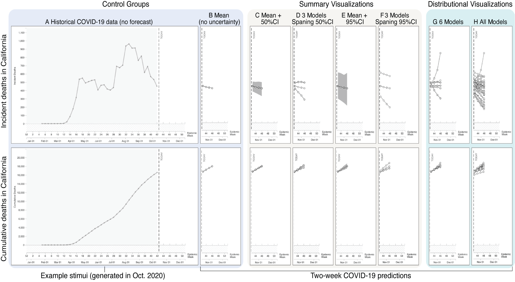
People worldwide use SARS-CoV-2 (COVID-19) visualizations to make life and death decisions about pandemic risks. Understanding how these visualizations influence risk perceptions to improve pandemic communication is crucial. To examine how COVID-19 visualizations influence risk perception, we conducted two experiments online in October and December of 2020 (N = 2549) where we presented participants with 34 visualization techniques (available at the time of publication on the CDC's website) of the same COVID-19 mortality data. We found that visualizing data using a cumulative scale consistently led to participants believing that they and others were at more risk than before viewing the visualizations. In contrast, visualizing the same data with a weekly incident scale led to variable changes in risk perceptions. Further, uncertainty forecast visualizations also affected risk perceptions, with visualizations showing six or more models increasing risk estimates more than the others tested. Differences between COVID-19 visualizations of the same data produce different risk perceptions, fundamentally changing viewers' interpretation of information.
Authors


Citation
Impact of COVID-19 forecast visualizations on pandemic risk perceptions
Lace Padilla, Helia Hosseinpour, Racquel Fygenson, Jennifer Howell, Rumi Chunara, and Enrico Bertini. Scientific Reports. 2022. DOI: 10.1038/s41598-022-05353-1
PDF | Preprint | DOI | Publisher correction | BibTeX
Khoury Vis Lab — Northeastern University
* West Village H, Room 302, 440 Huntington Ave, Boston, MA 02115, USA
* 100 Fore Street, Portland, ME 04101, USA
* Carnegie Hall, 201, 5000 MacArthur Blvd, Oakland, CA 94613, USA