Evaluating the effect of timeline shape on visualization task performance
Abstract
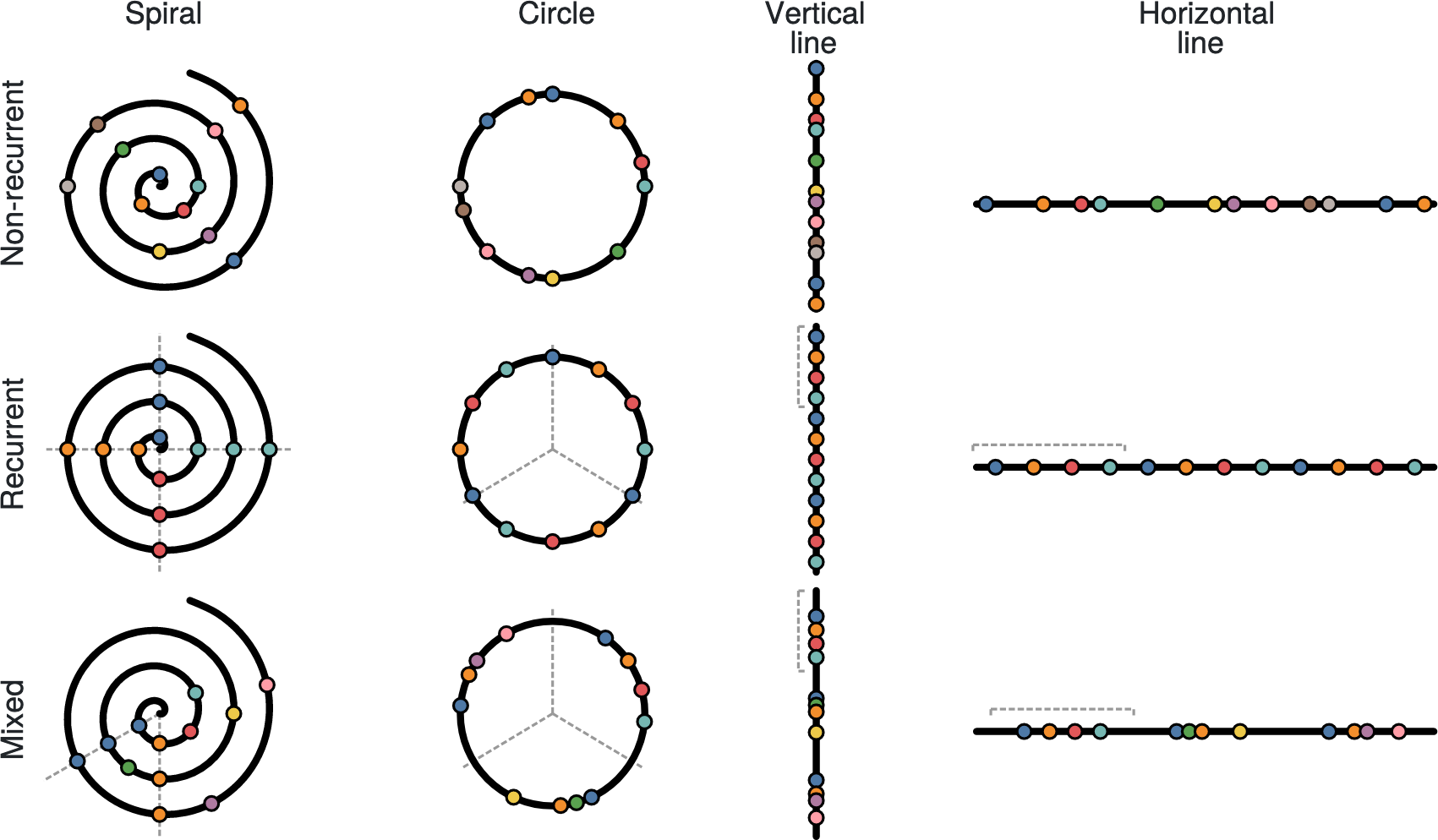
Timelines are commonly represented on a horizontal line, which is not necessarily the most effective way to visualize temporal event sequences. However, few experiments have evaluated how timeline shape influences task performance. We present the design and results of a controlled experiment run on Amazon Mechanical Turk (n=192) in which we evaluate how timeline shape affects task completion time, correctness, and user preference. We tested 12 combinations of 4 shapes — horizontal line, vertical line, circle, and spiral — and 3 data types — recurrent, non-recurrent, and mixed event sequences. We found good evidence that timeline shape meaningfully affects user task completion time but not correctness and that users have a strong shape preference. Building on our results, we present design guidelines for creating effective timeline visualizations based on user task and data types. A free copy of this paper, the evaluation stimuli and data, and code are available osf.io/qr5yu/.
Materials
PDF | Preprint | DOI | Supplement | Video Preview | Video Presentation | Video Presentation (Archive) | Multiple Views Blog | BibTeXAuthors


Elin Carstensdottir
Magy Seif El-Nasr


Citation
Evaluating the effect of timeline shape on visualization task performance
Sara Di Bartolomeo, Aditeya Pandey, Aristotelis Sigiouan Leventidis, David Saffo, Uzma Haque Syeda, Elin Carstensdottir, Magy Seif El-Nasr, Michelle A. Borkin, and Cody Dunne. Proc. CHI Conference on Human Factors in Computing Systems—CHI. 2020. DOI: 10.1145/3313831.3376237
PDF | Preprint | DOI | Supplement | Video Preview | Video Presentation | Video Presentation (Archive) | Multiple Views Blog | BibTeX
Khoury Vis Lab — Northeastern University
* West Village H, Room 302, 440 Huntington Ave, Boston, MA 02115, USA
* 100 Fore Street, Portland, ME 04101, USA
* Carnegie Hall, 201, 5000 MacArthur Blvd, Oakland, CA 94613, USA